themes.jabref.org
Custom themes for JabRef
Project maintained by JabRef Hosted on GitHub Pages — Theme by mattgraham
Custom JabRef Themes
Customize the look of JabRef using CSS!
JabRef bundles every theme in this repository that covers both color schemes, its own JabRef theme included; they appear in the theme selection without downloading anything. On top of the theme you can load a custom CSS file that overrides only what you want to change. This page and the themes target the theme model introduced with JabRef 6 (JabRef/jabref#15798).
JabRef 5.x: the previous versions of the themes, based on the old -jr-* variables, are available in the repository history.
The style guide states the few rules behind the tokens.
Themes
All themes, JabRef’s own and the contributed ones, are located in the subfolder themes. Themes that cover both color schemes in one file (via @media (prefers-color-scheme: …)) live directly in themes/ and work with any color scheme. The Dark and Light subfolders hold the themes that only cover one scheme; select the matching color scheme in JabRef when using those.
Gallery
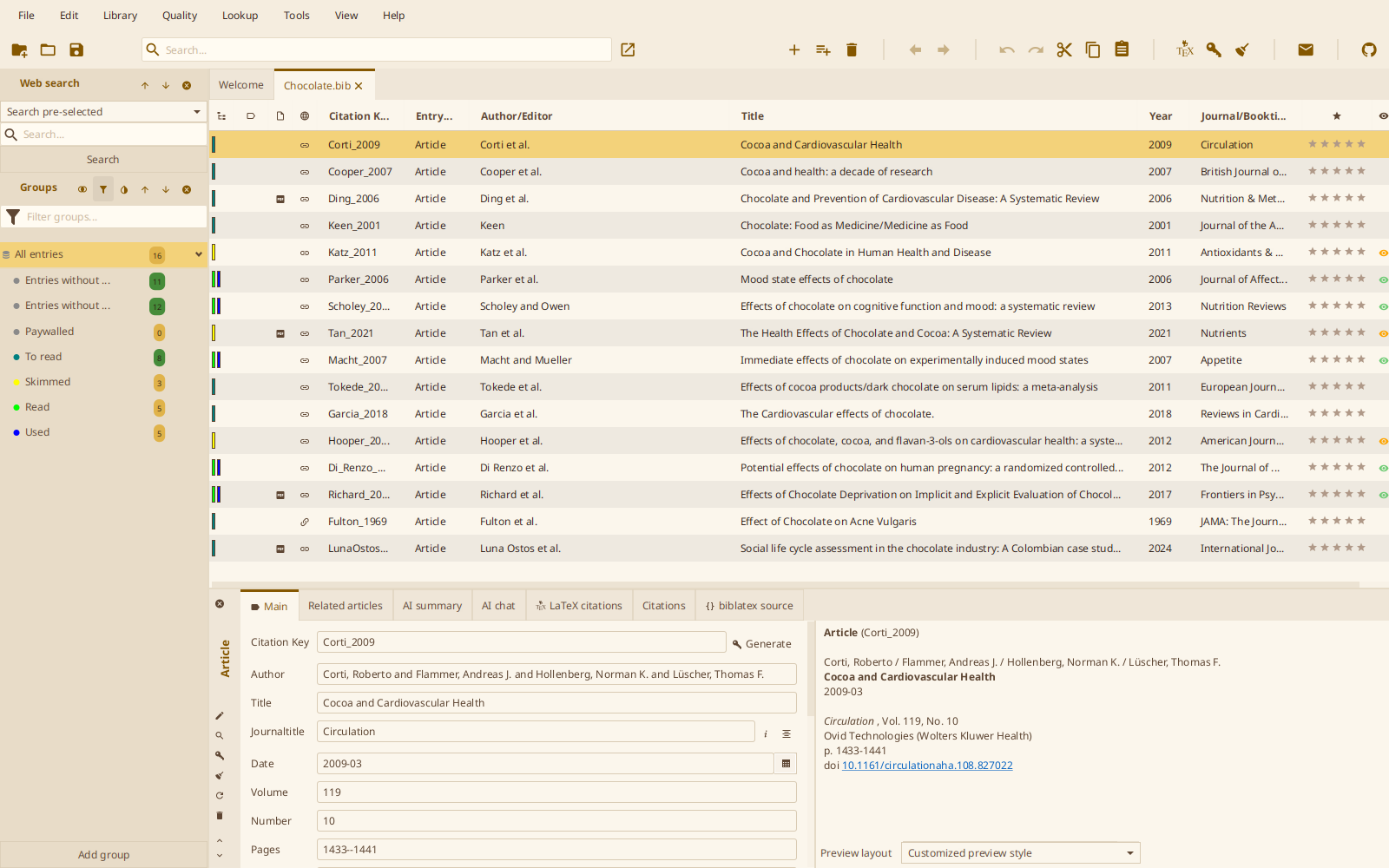
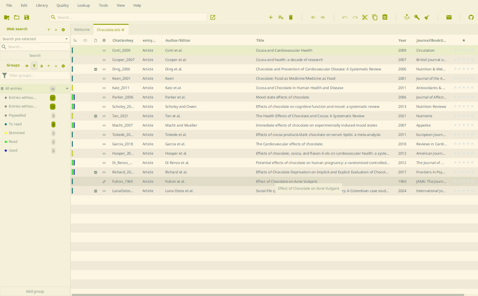
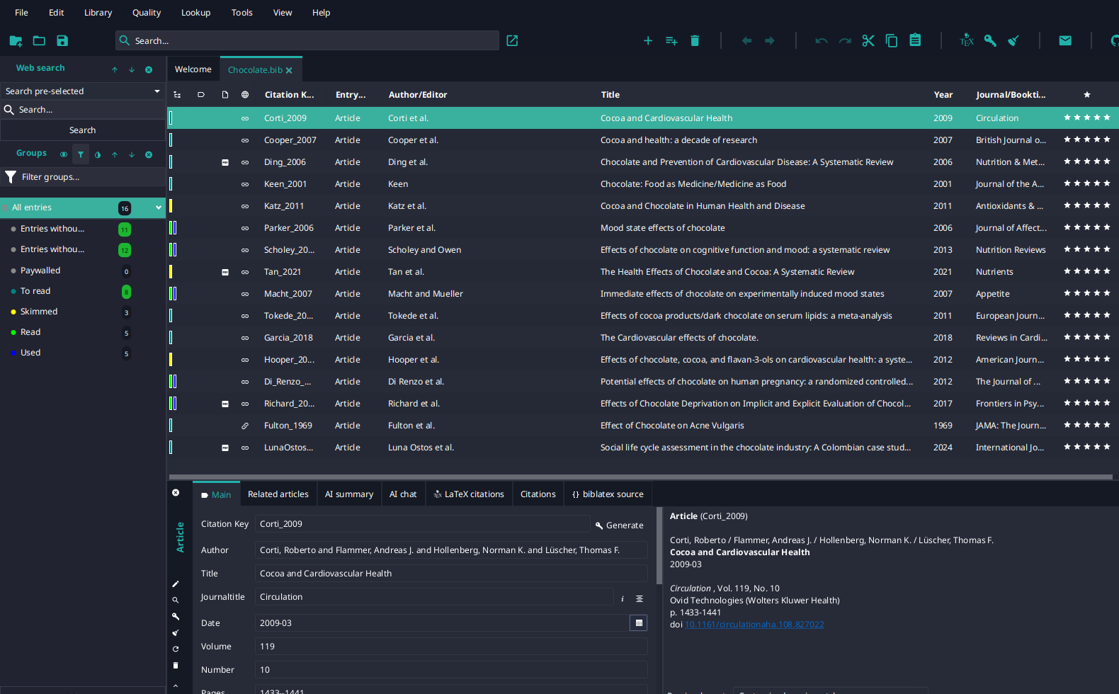
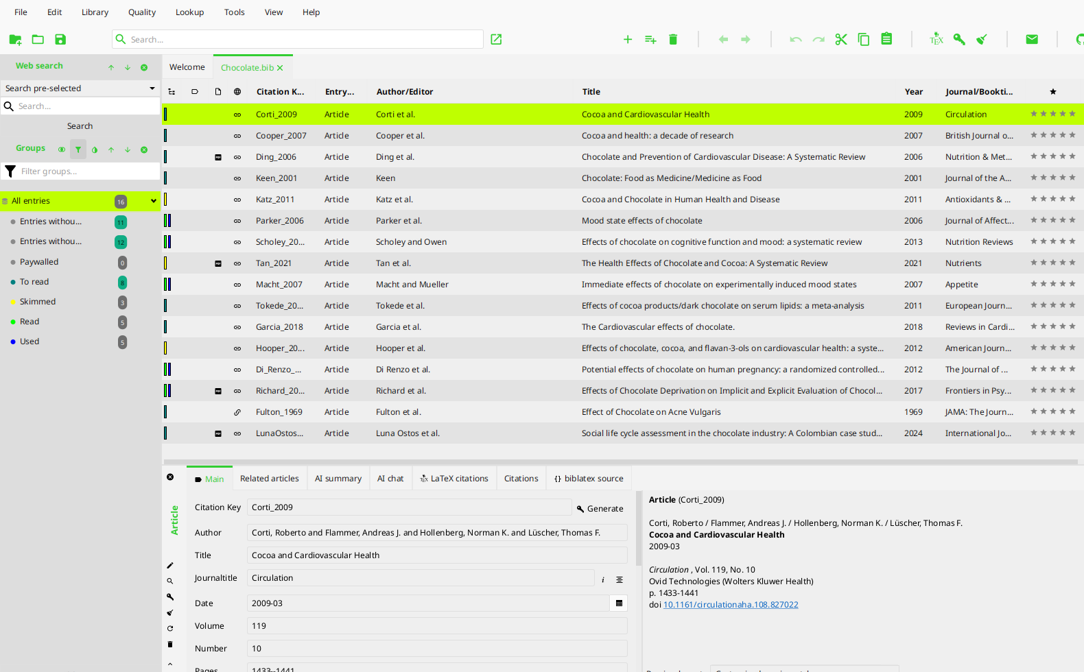
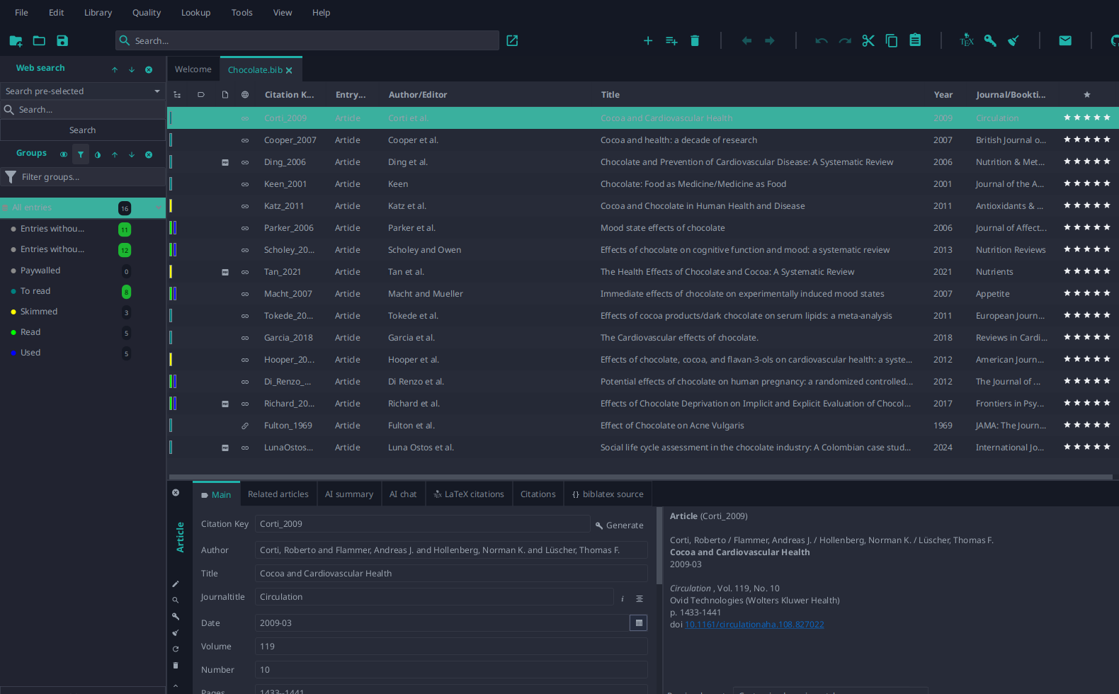
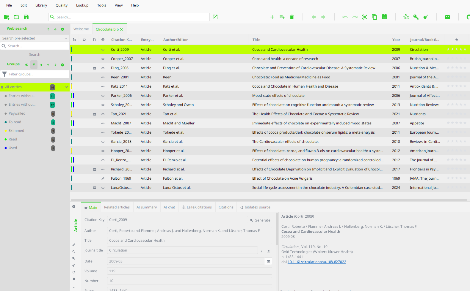
All screenshots were taken with JabRef 6 and the theme’s CSS file selected as custom theme, on the matching color scheme.
Dino Girl’s themes pair each dark hue with the light hue closest to it, so one file serves both color schemes. The blackandwhite and canaryyellow hues have no light counterpart and stay dark-only.
Both color schemes
| Theme | Dark | Light |
|---|---|---|
| Chocolate Honey | 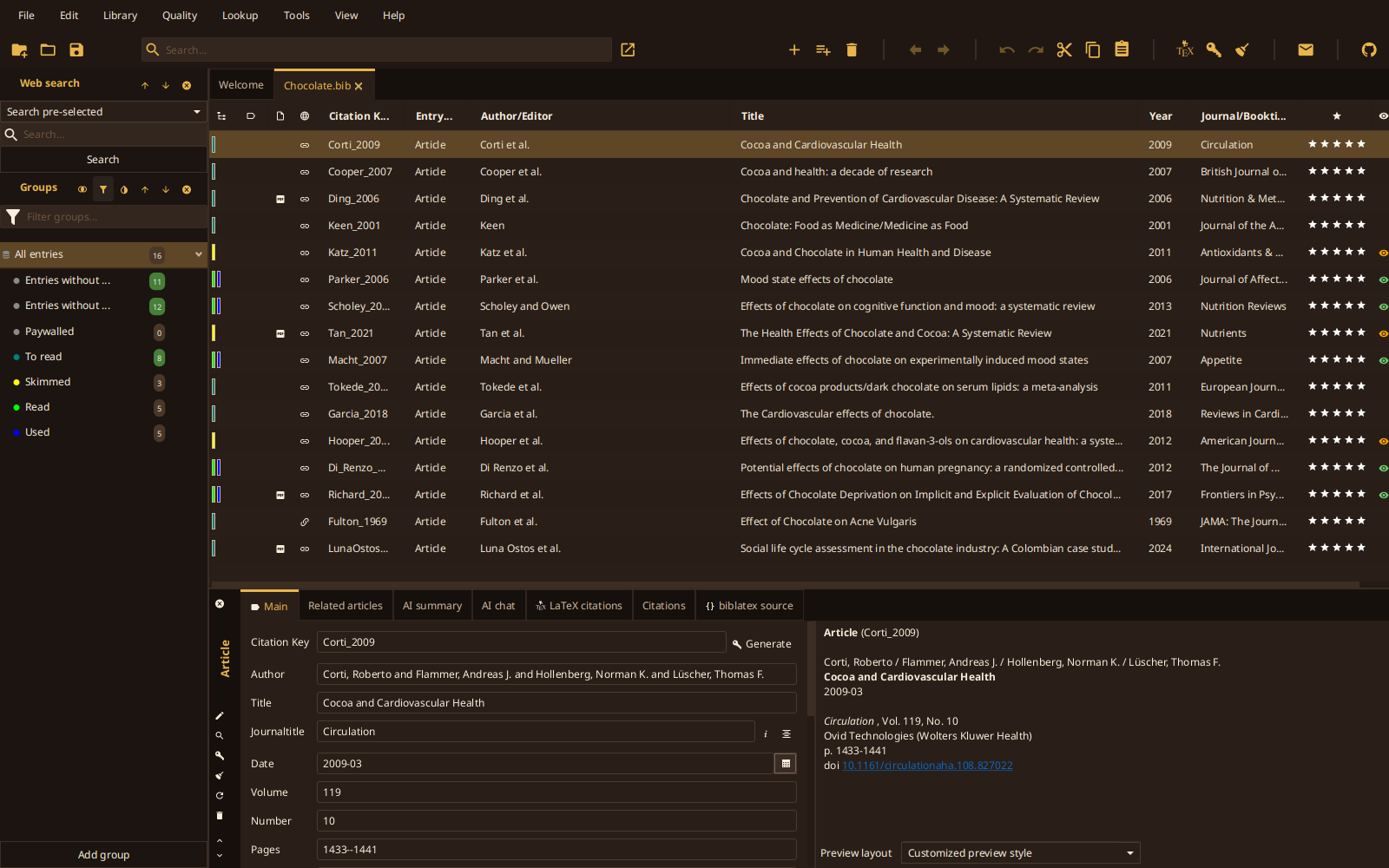 |
 |
| Everforest | 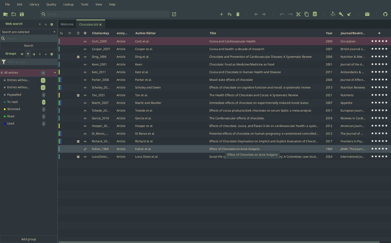 |
 |
| JabRef | 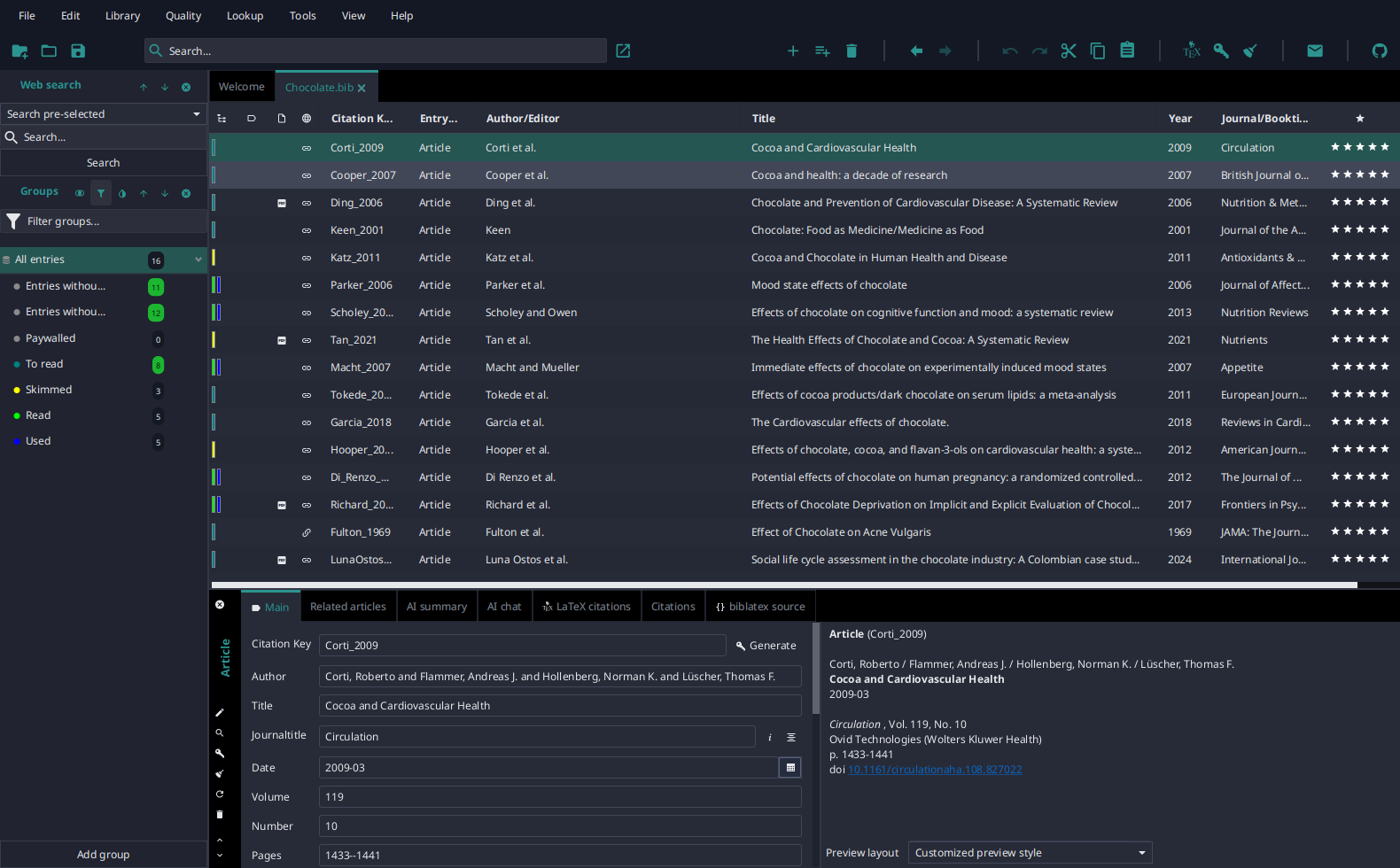 |
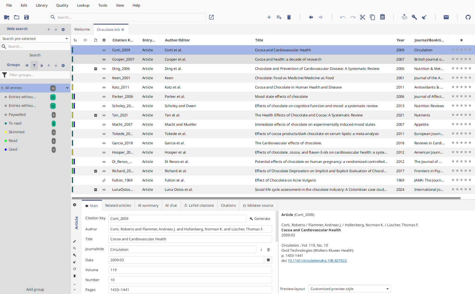 |
| Nord | 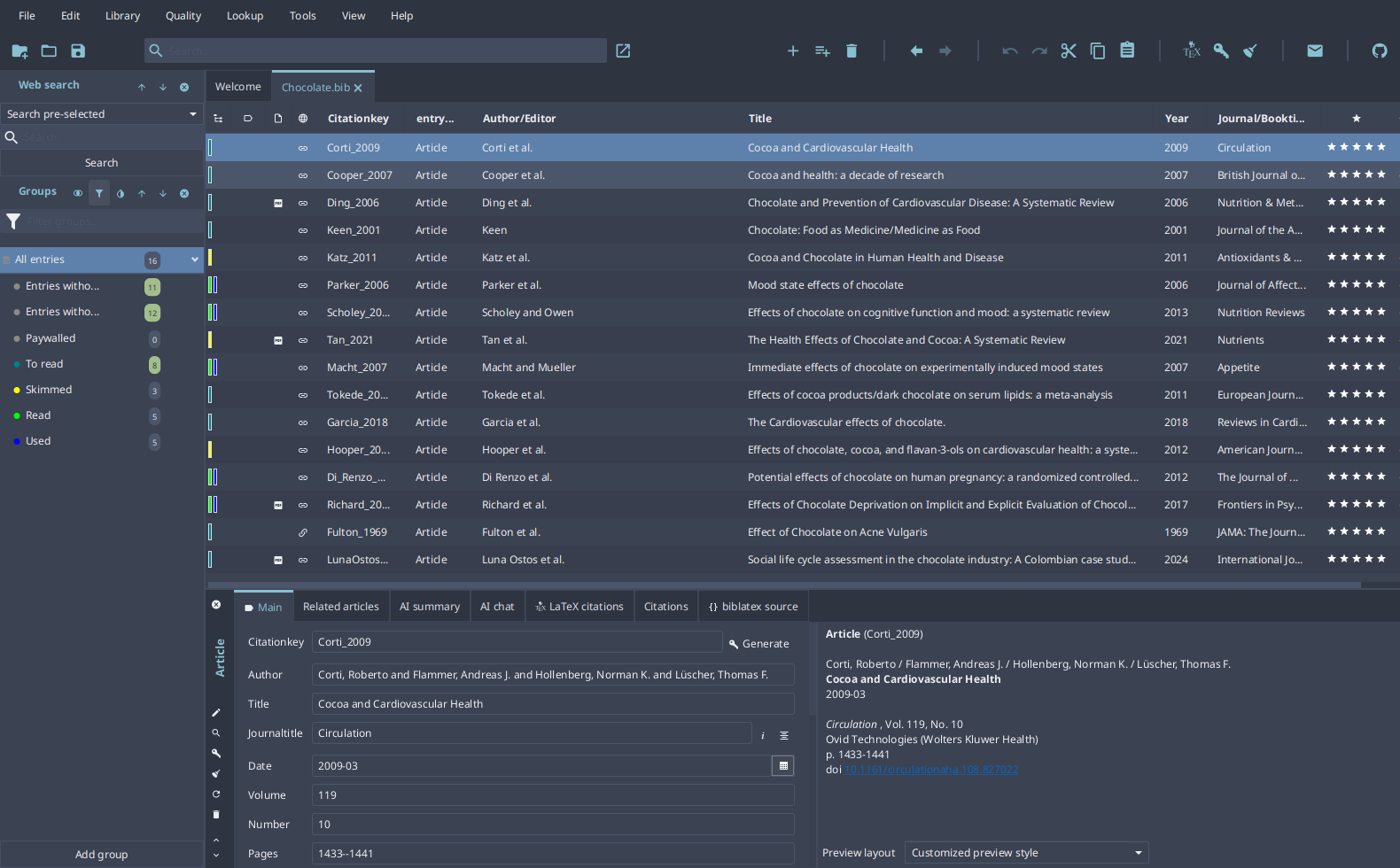 |
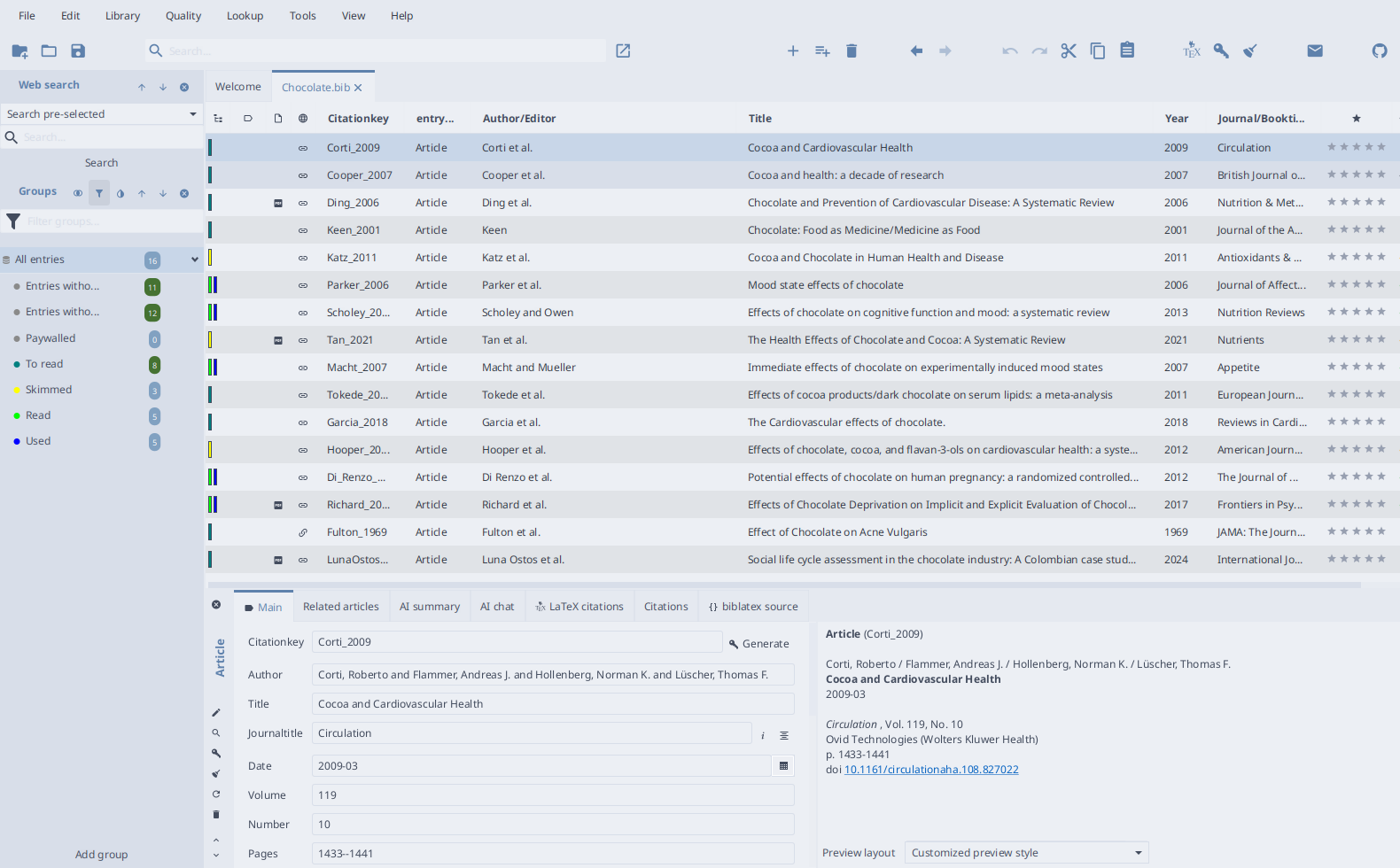 |
| Papers | 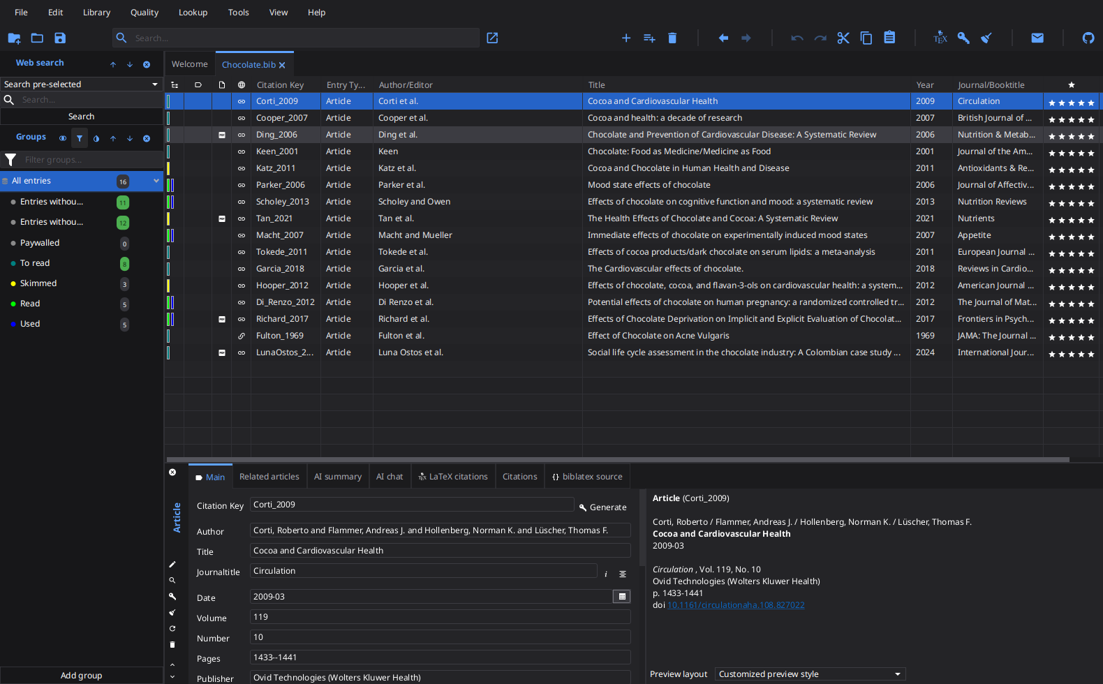 |
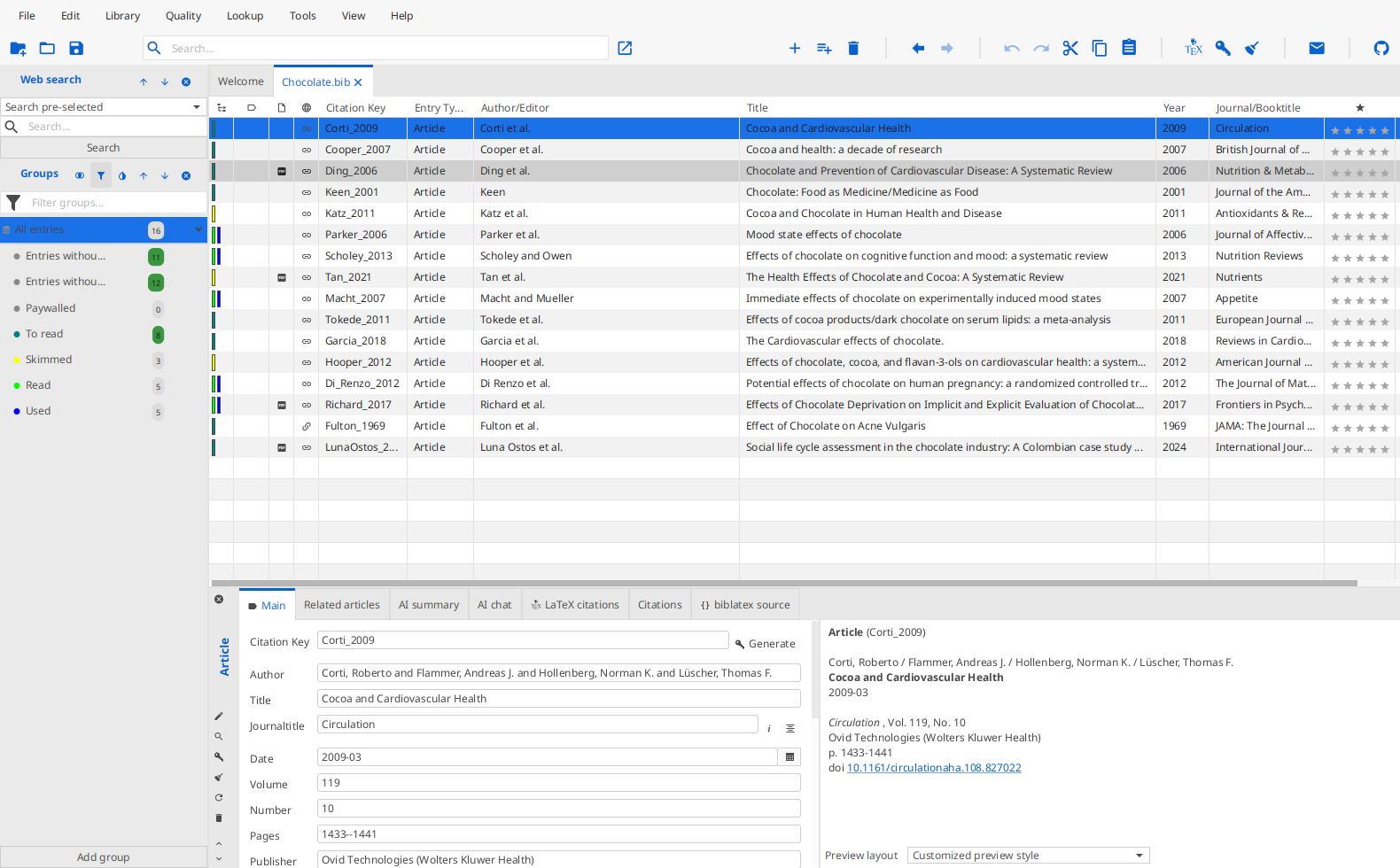 |
| Primer | 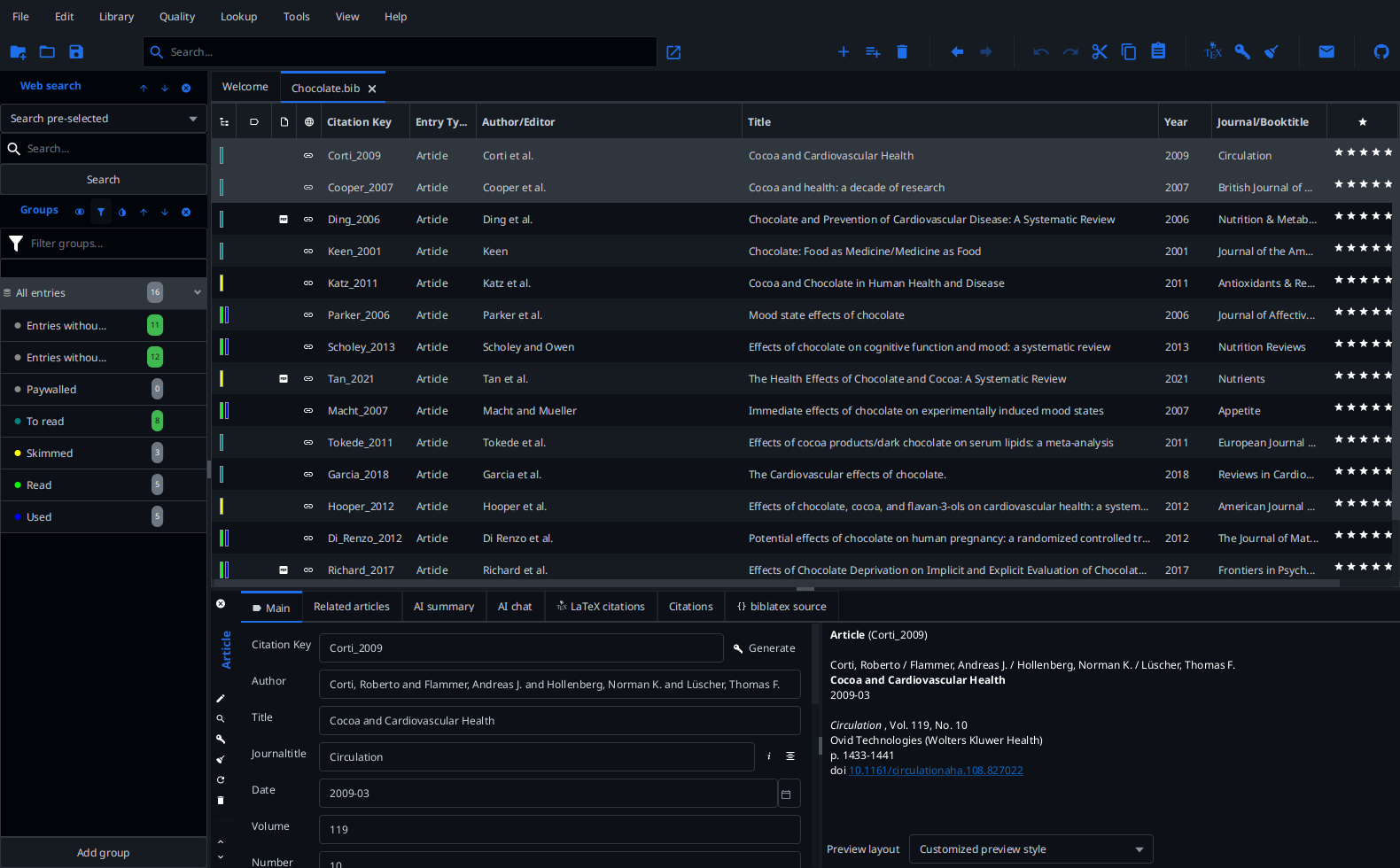 |
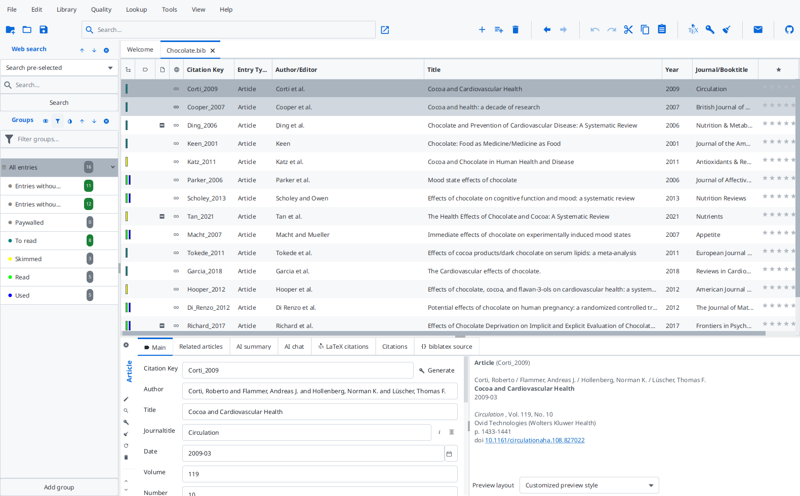 |
Dino Girl’s themes
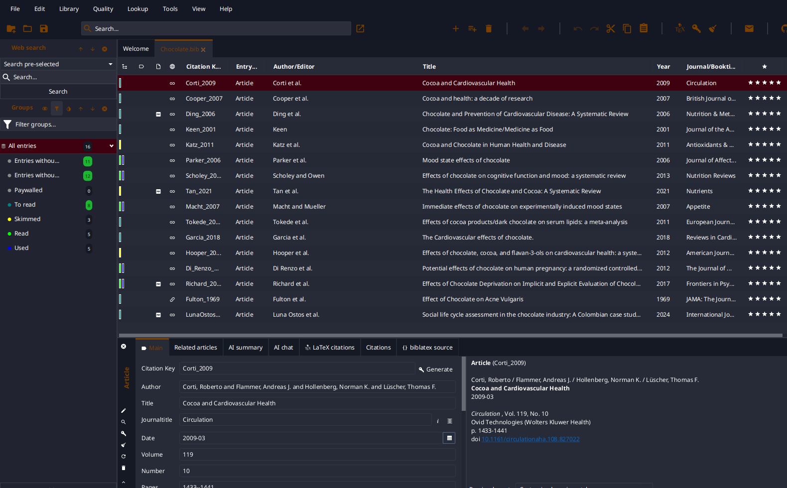
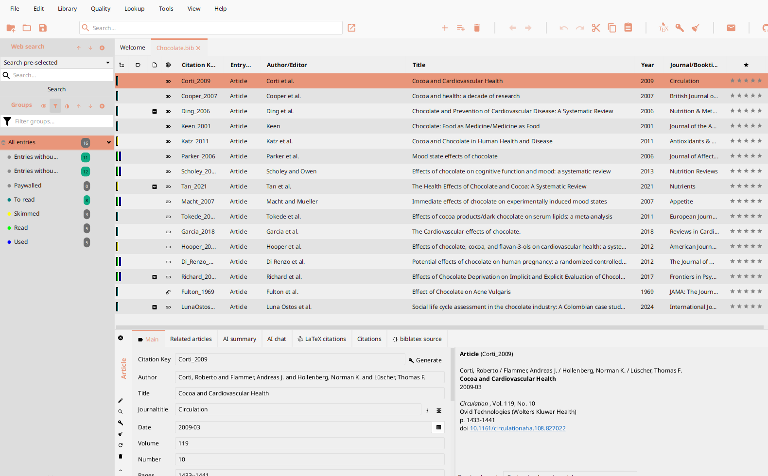
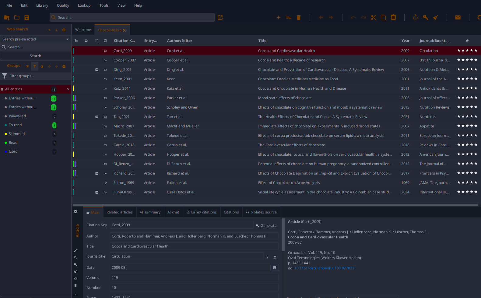
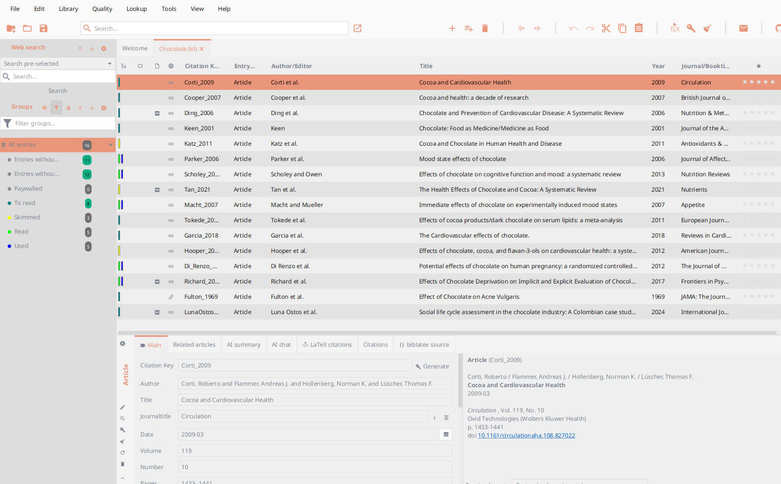
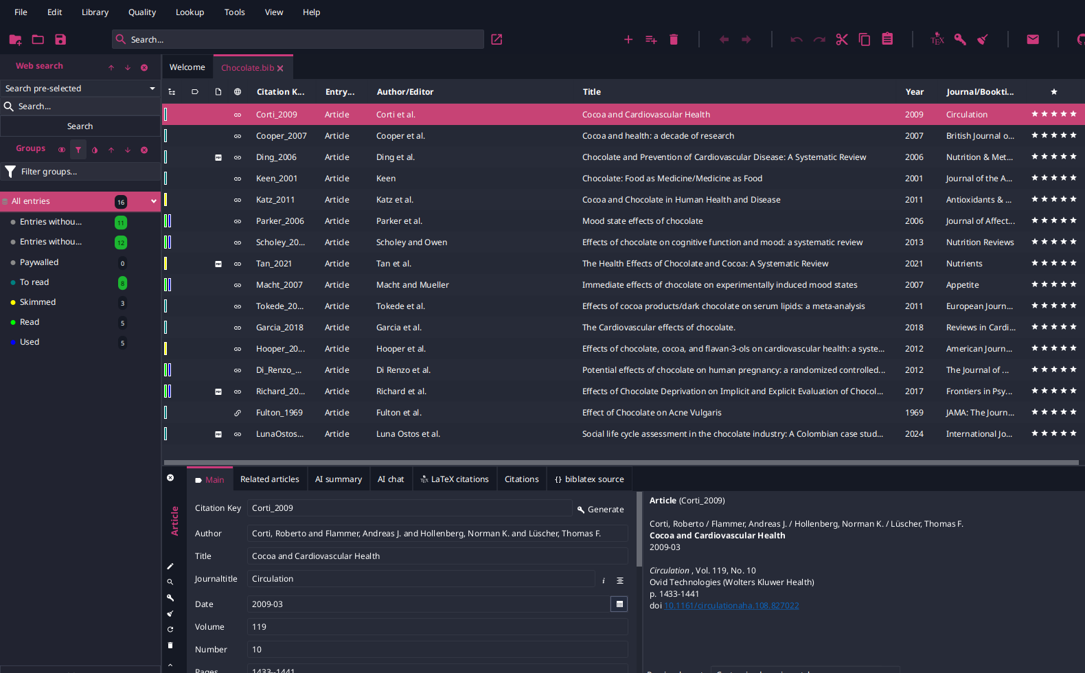
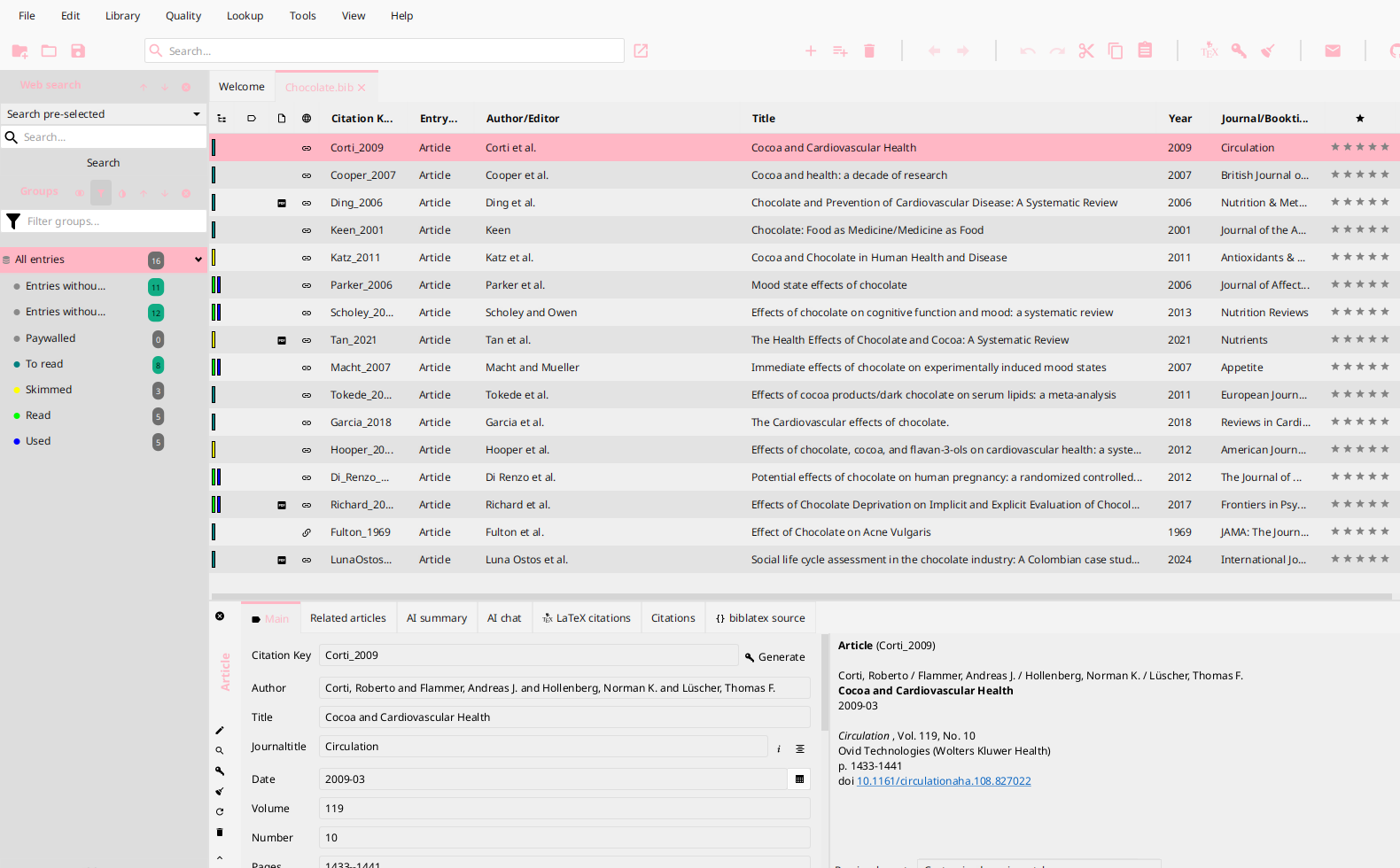
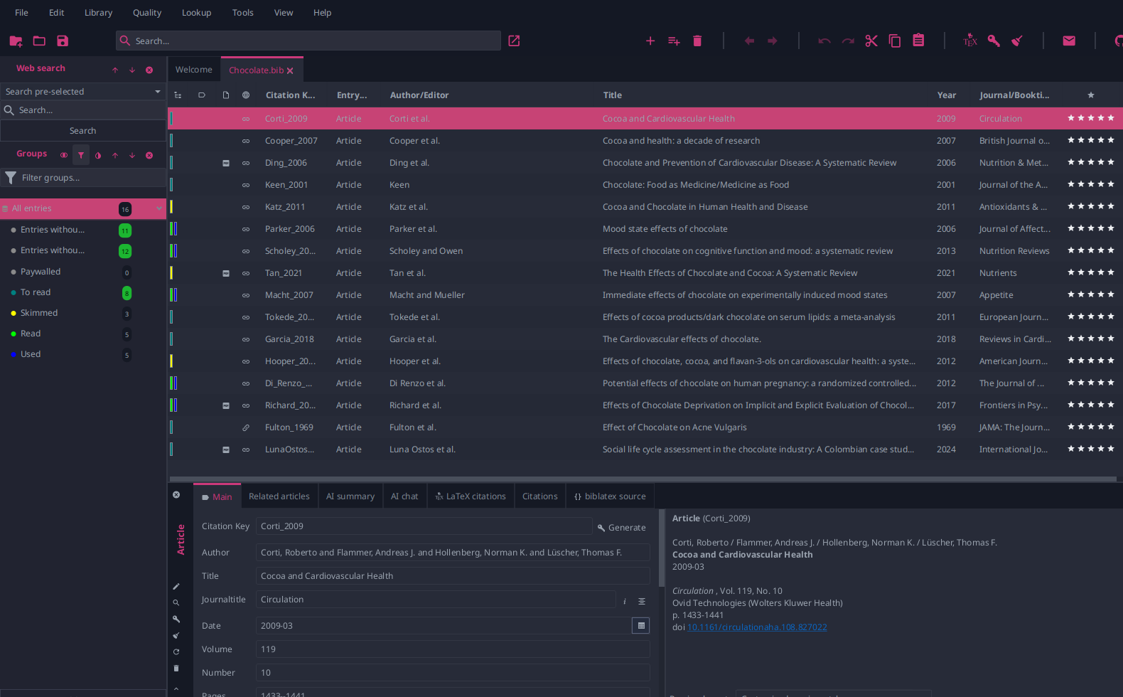
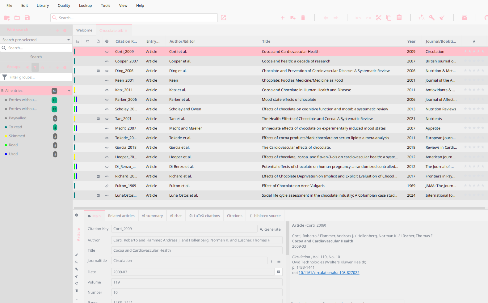
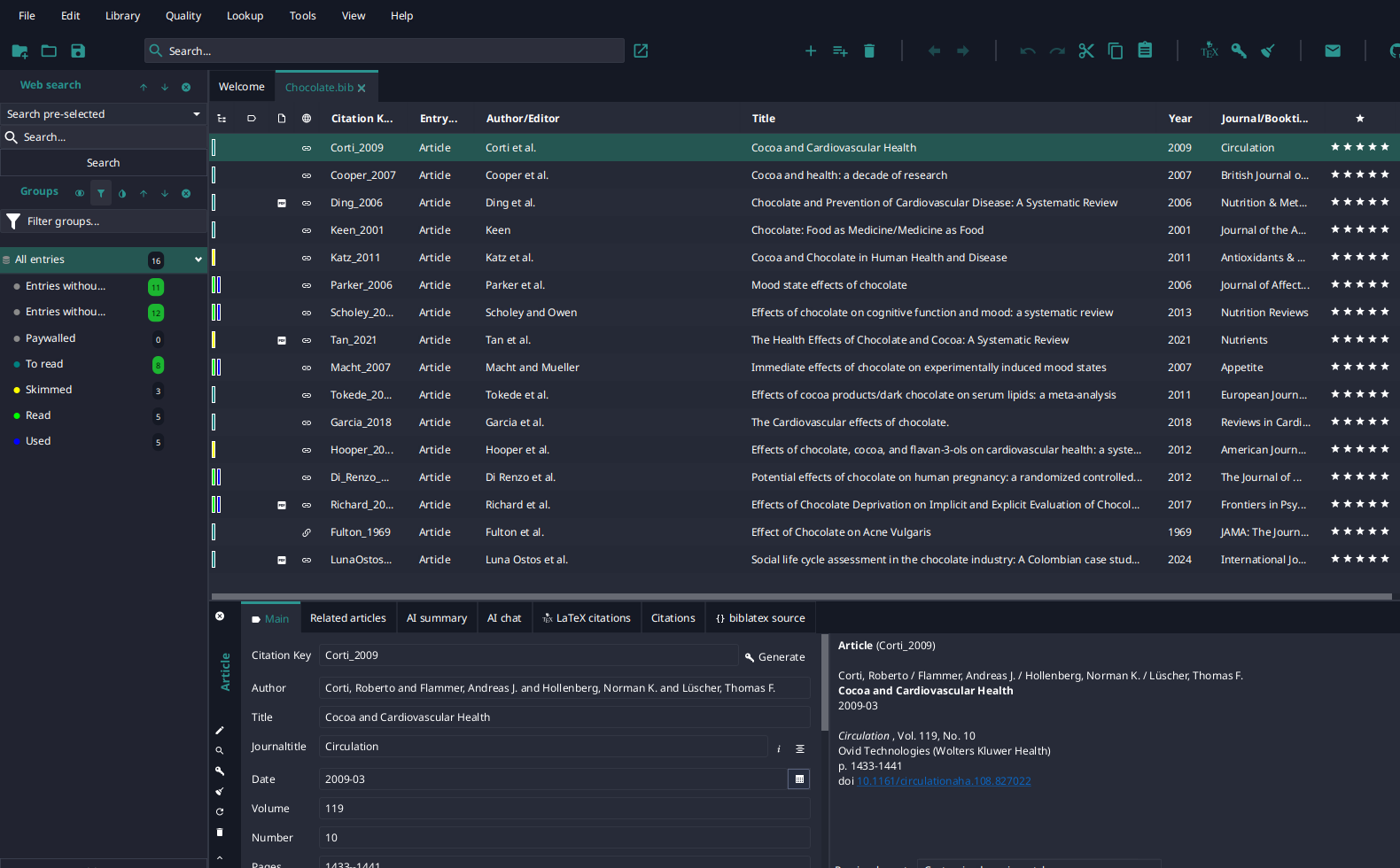
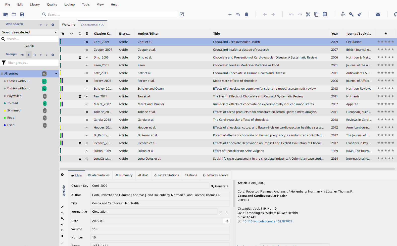
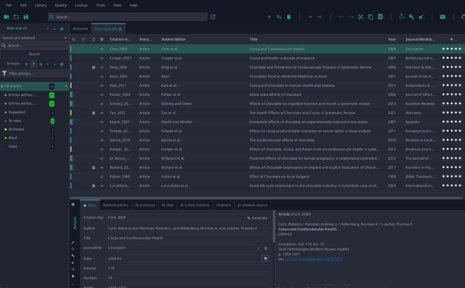
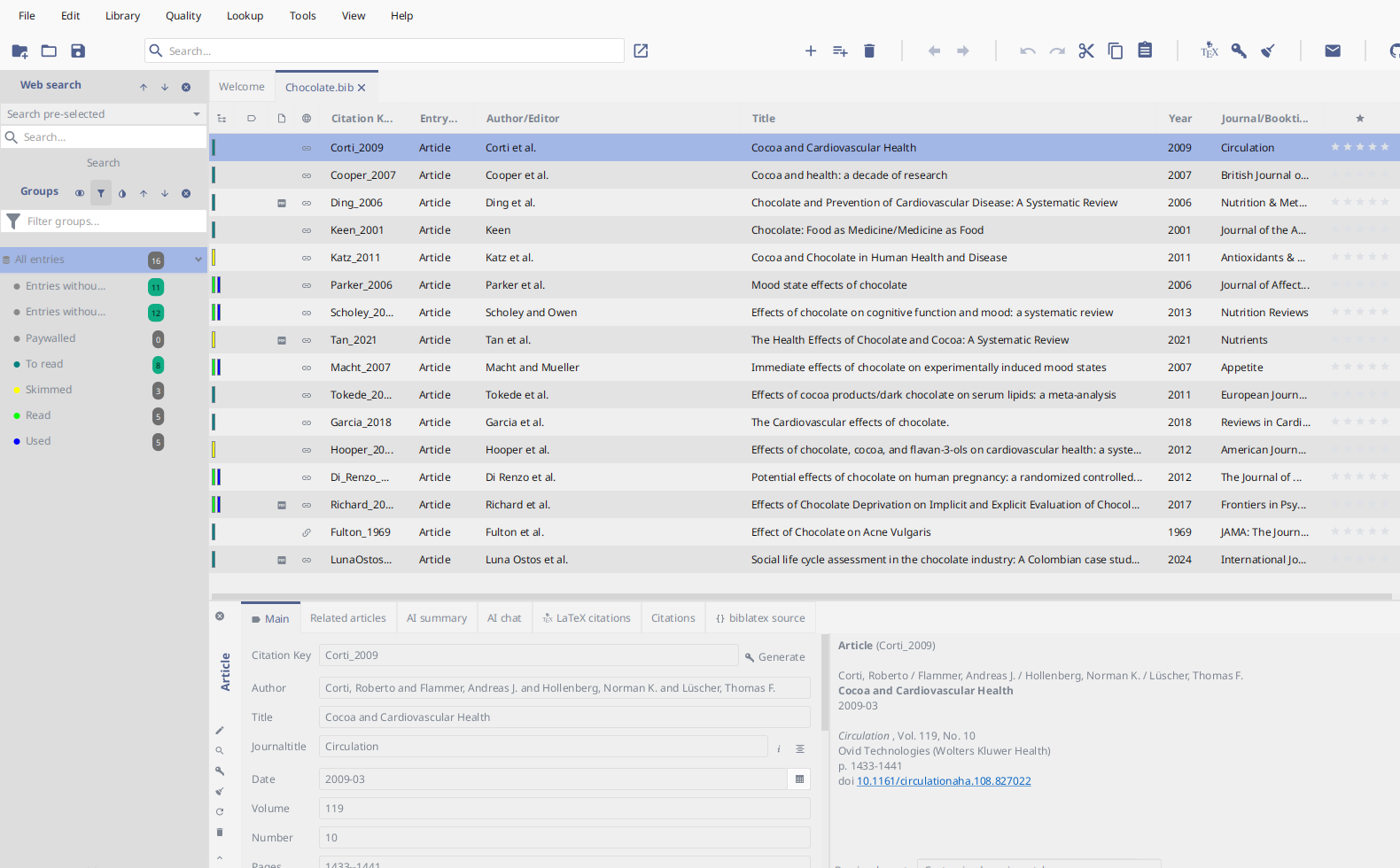
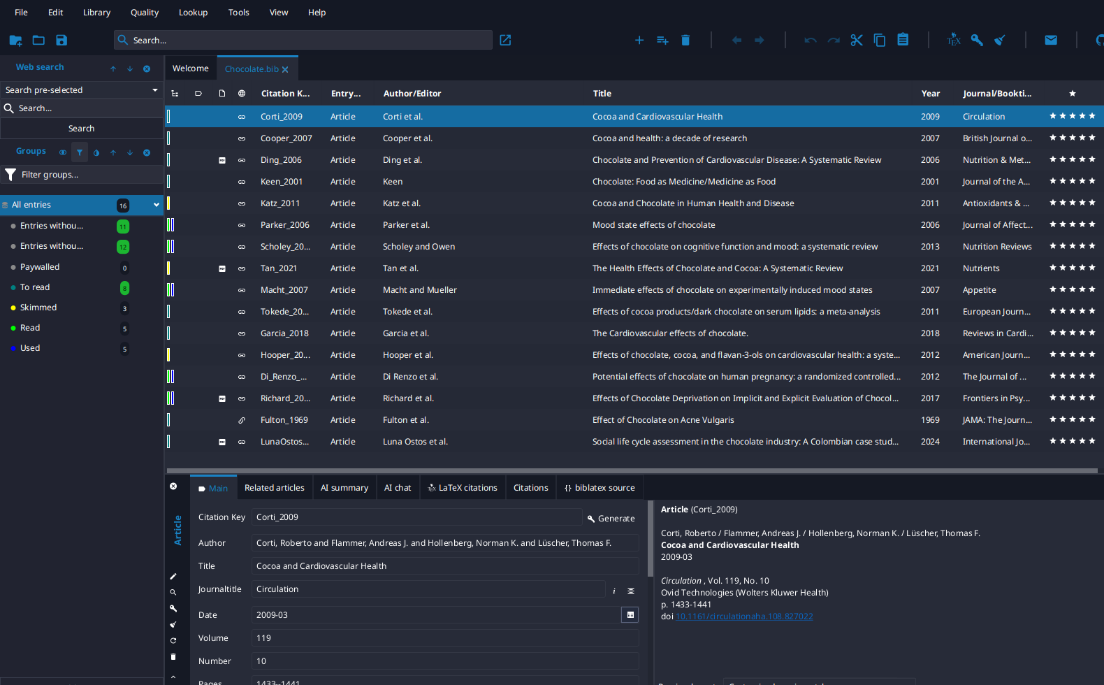
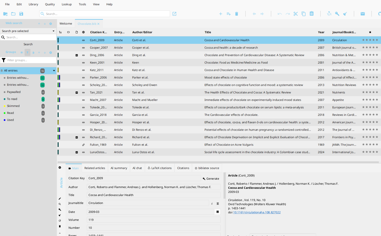
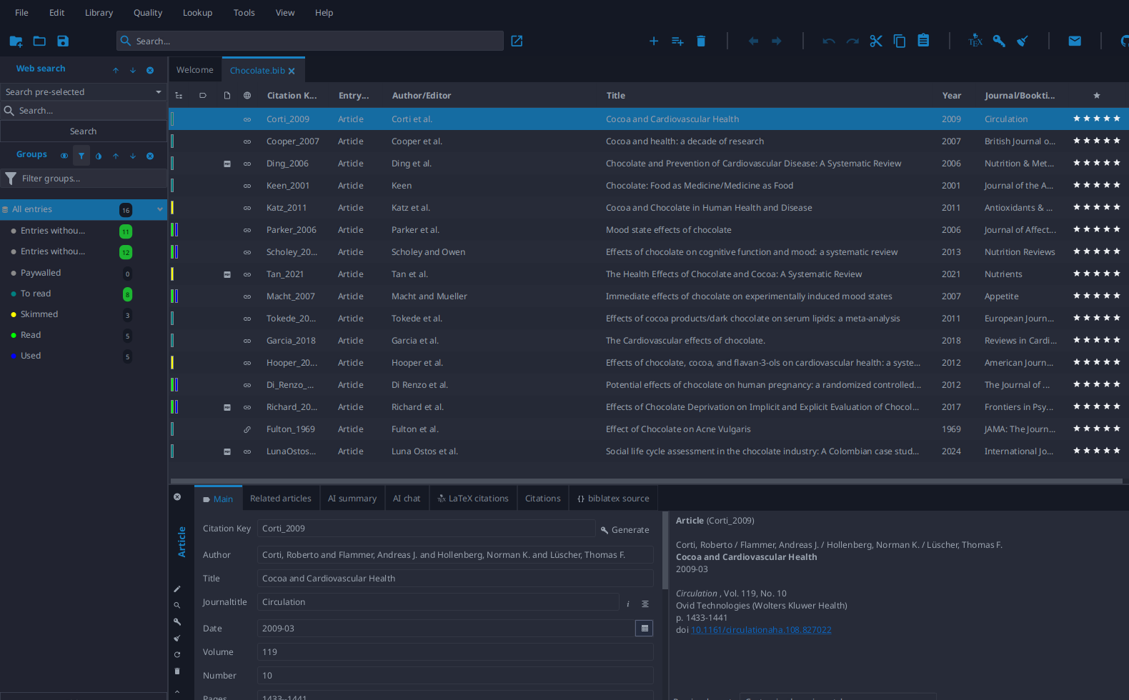
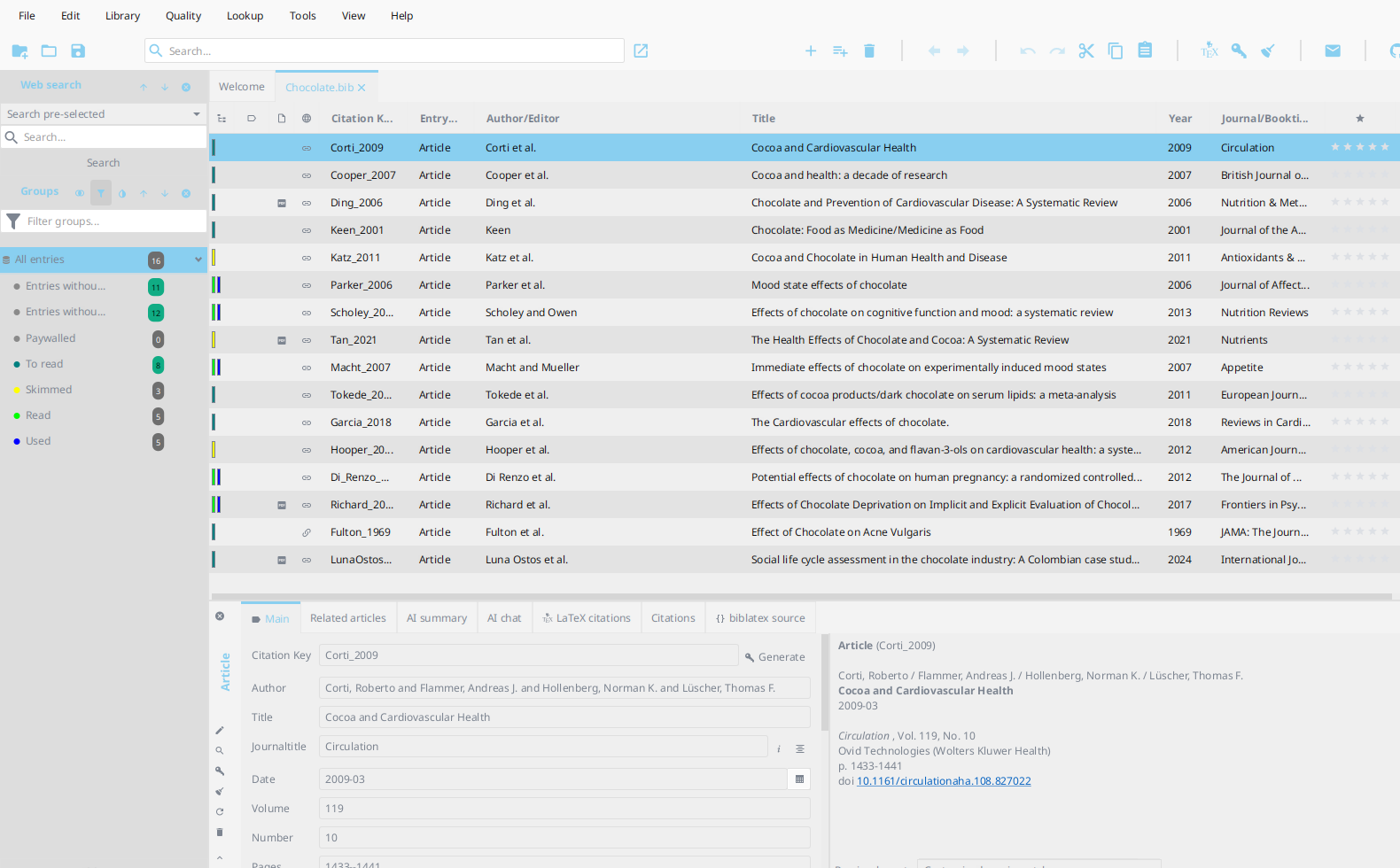
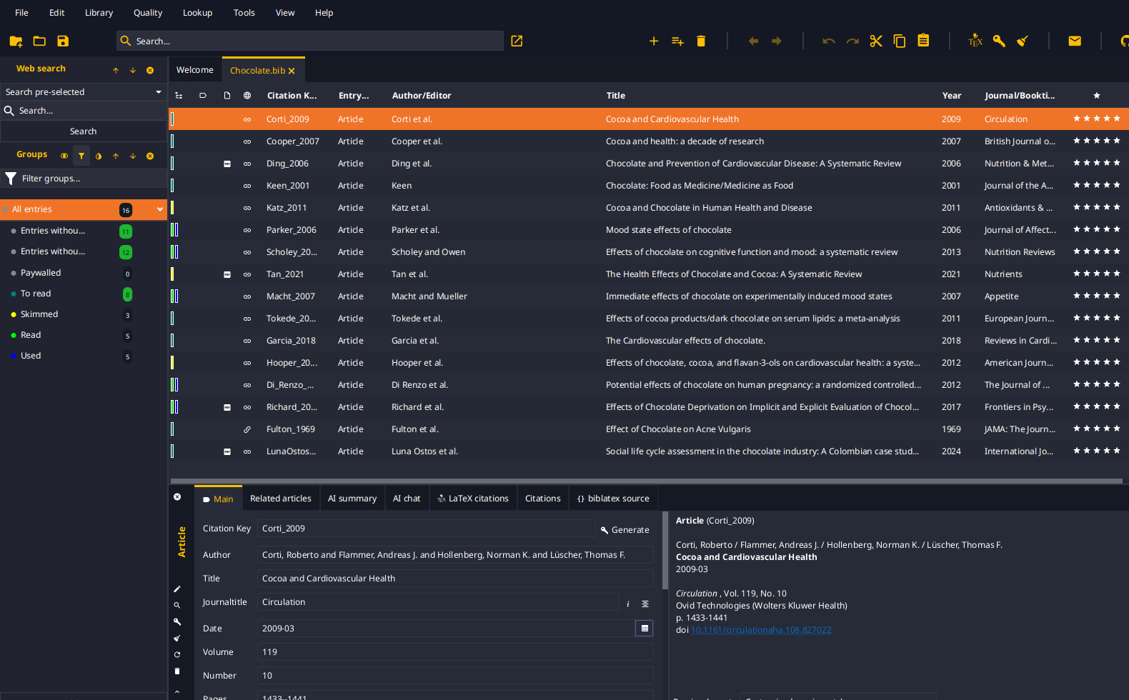
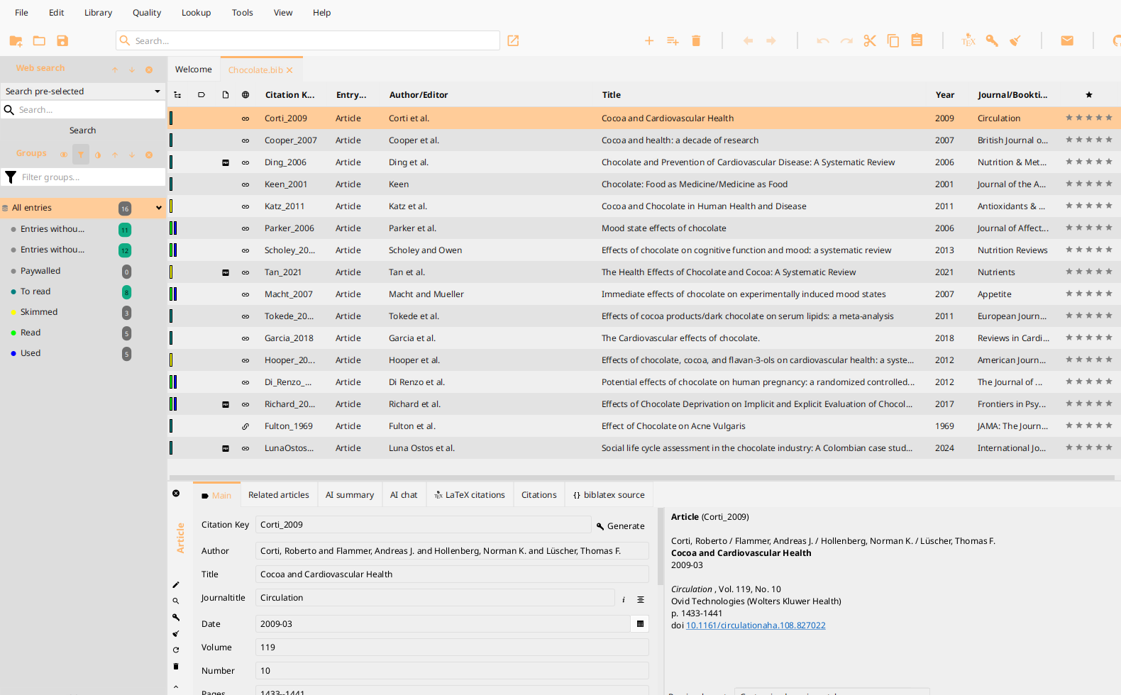
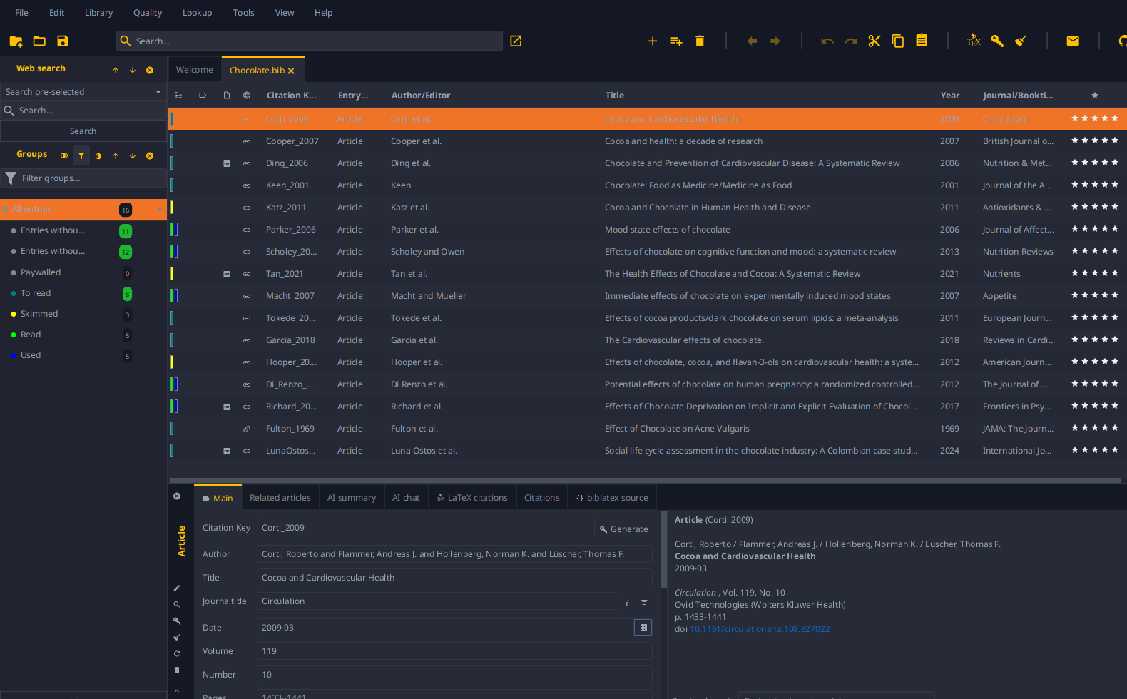
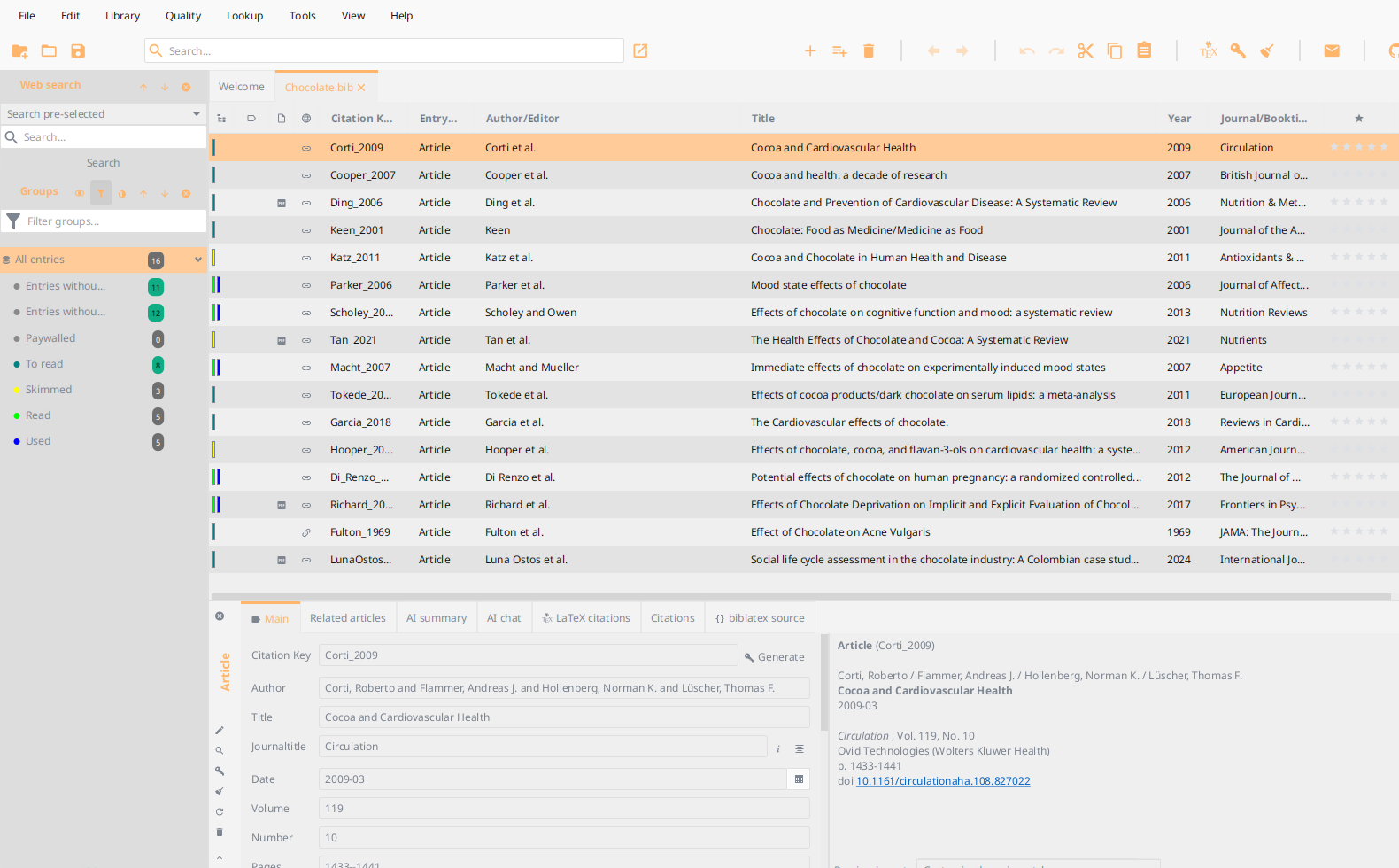
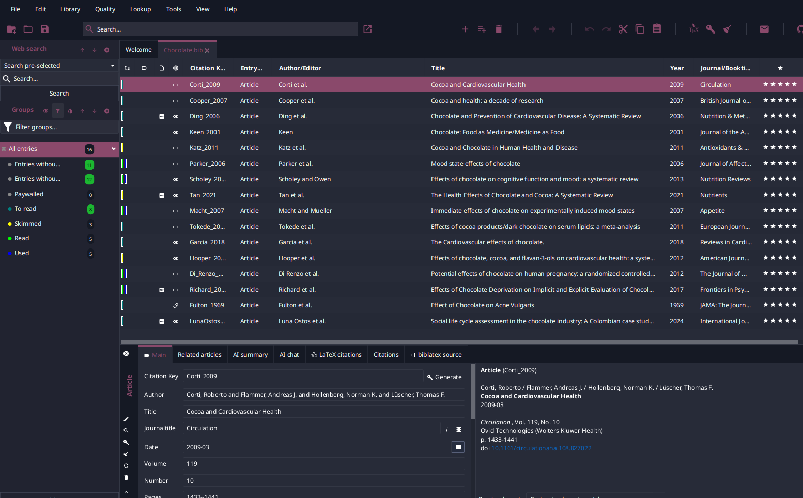
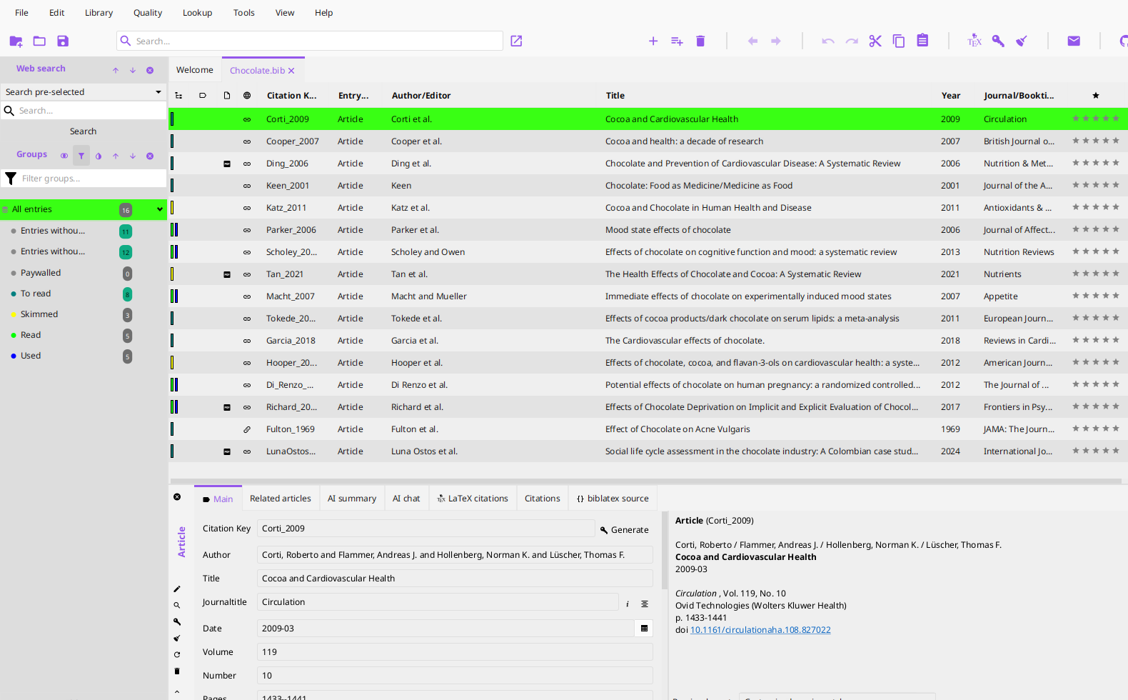
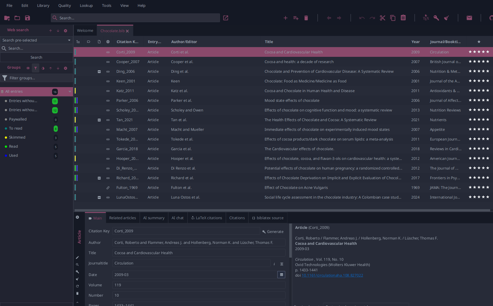
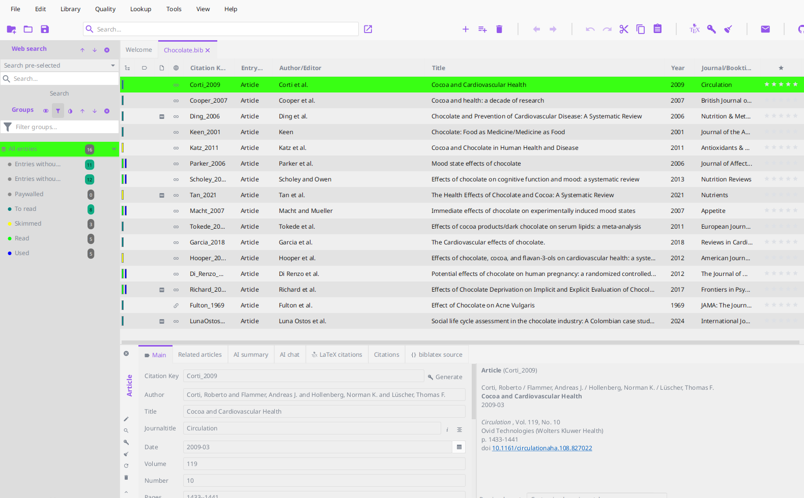
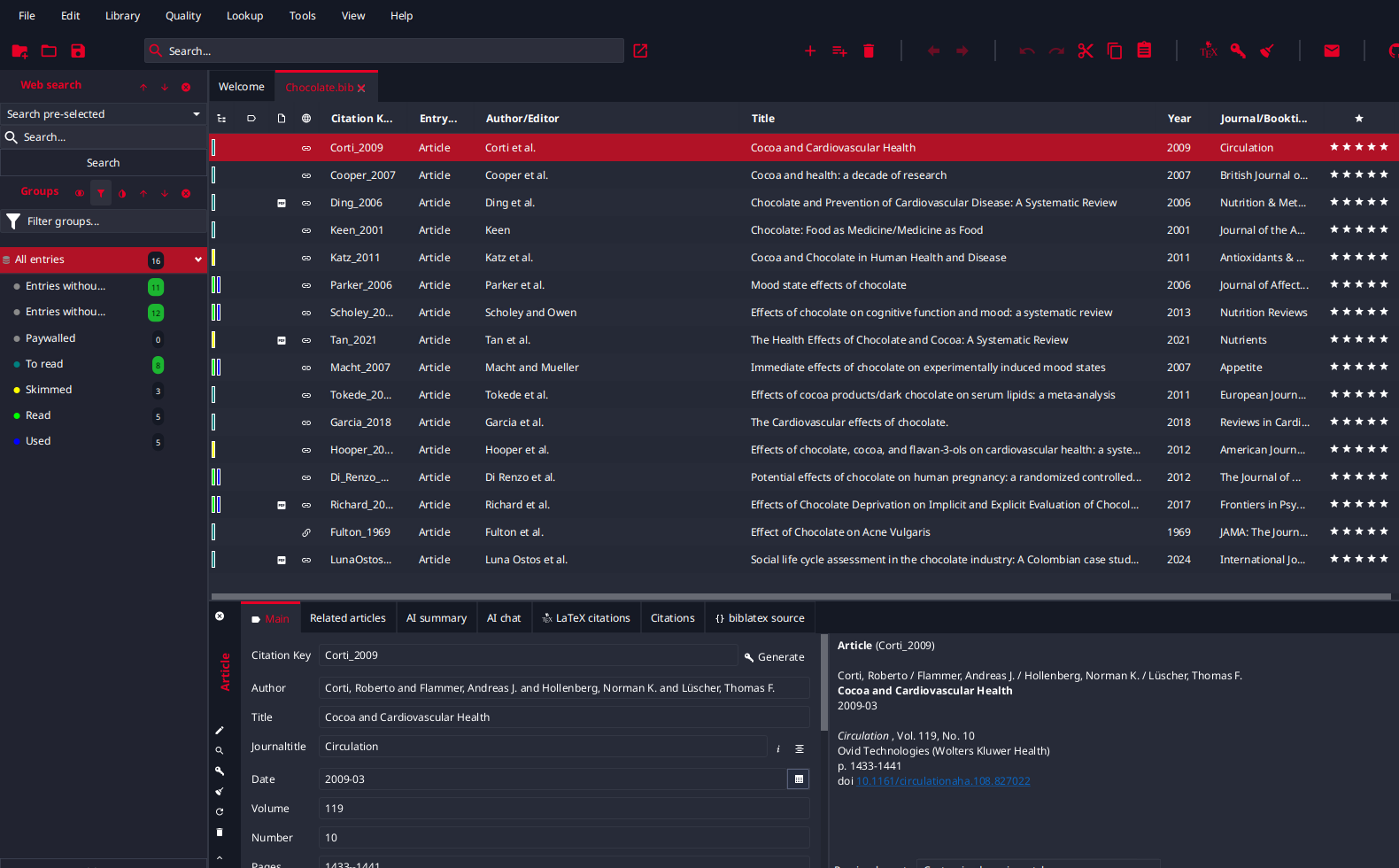
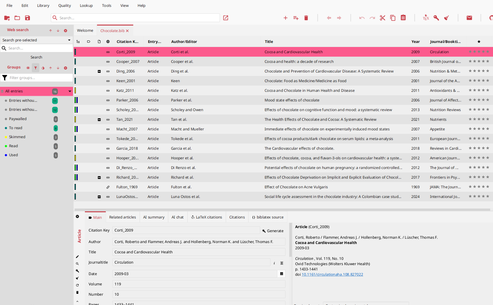
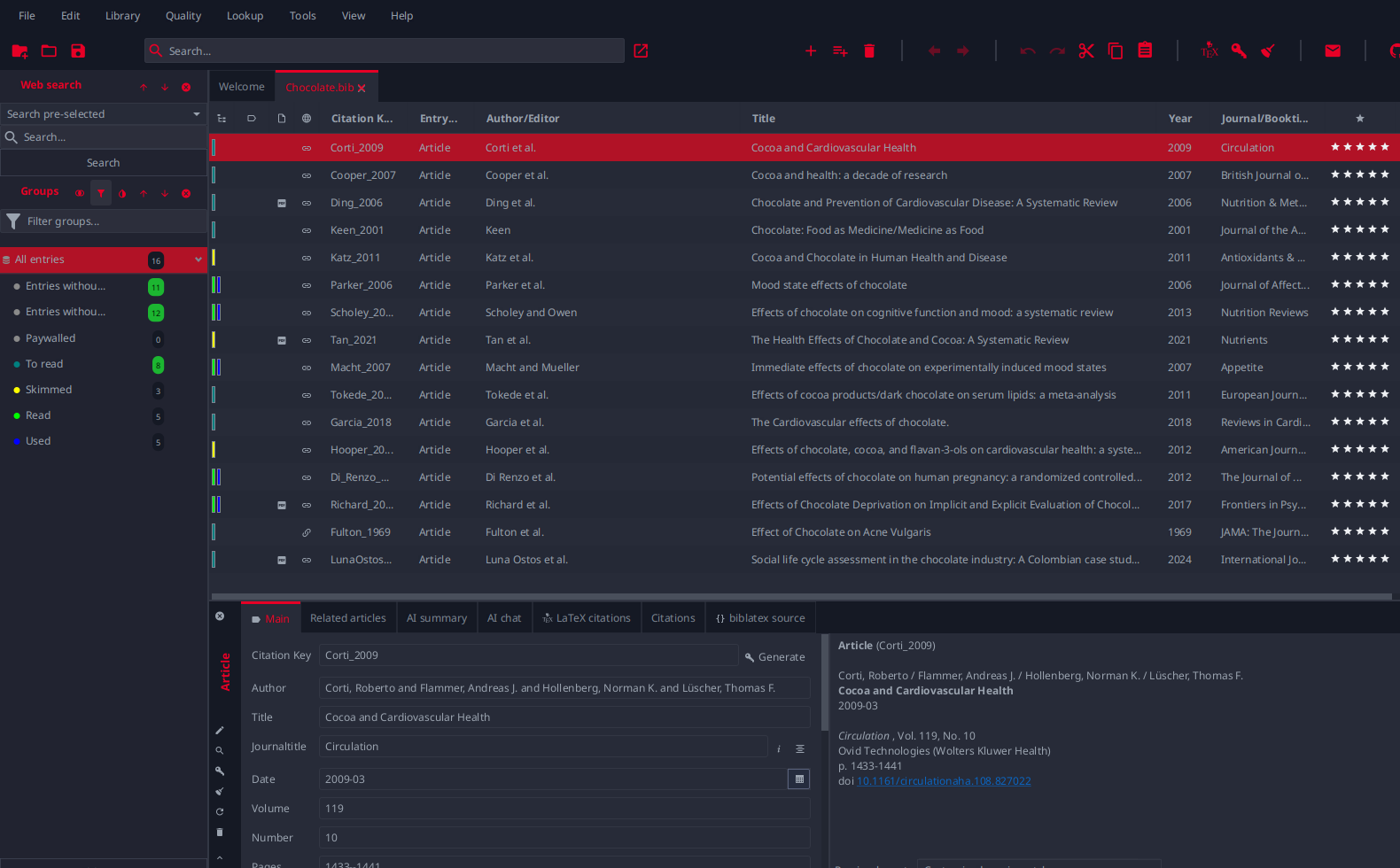
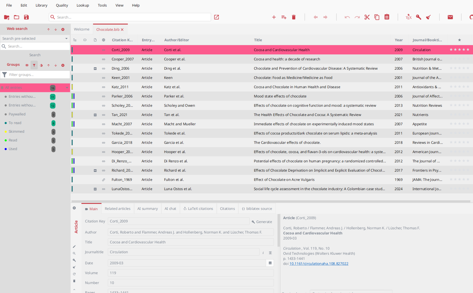
Dark themes
| Theme | Preview |
|---|---|
| DARK THEME-blackandwhite-greytext (Dino Girl’s dark themes) | 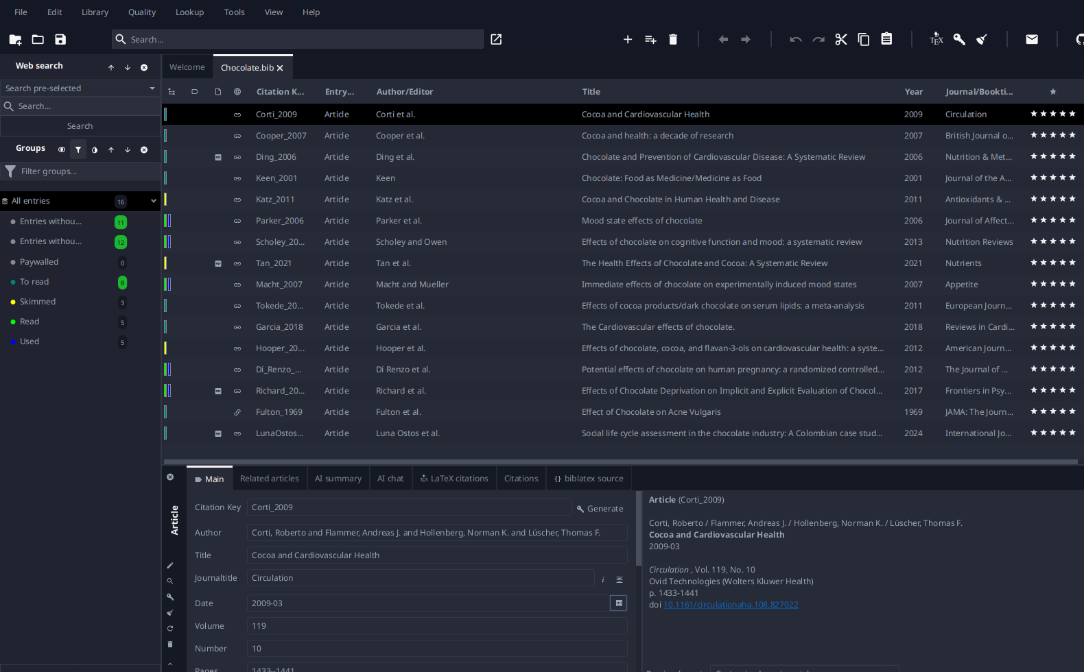 |
| DARK THEME-blackandwhite-whitetext (Dino Girl’s dark themes) | 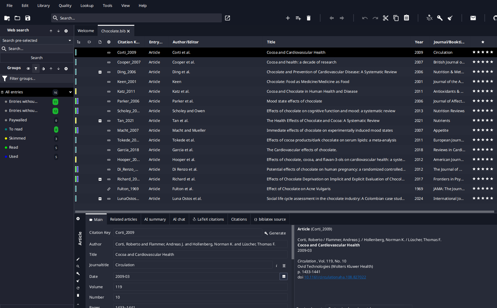 |
| DARK THEME-canaryyellow-greytext (Dino Girl’s dark themes) | 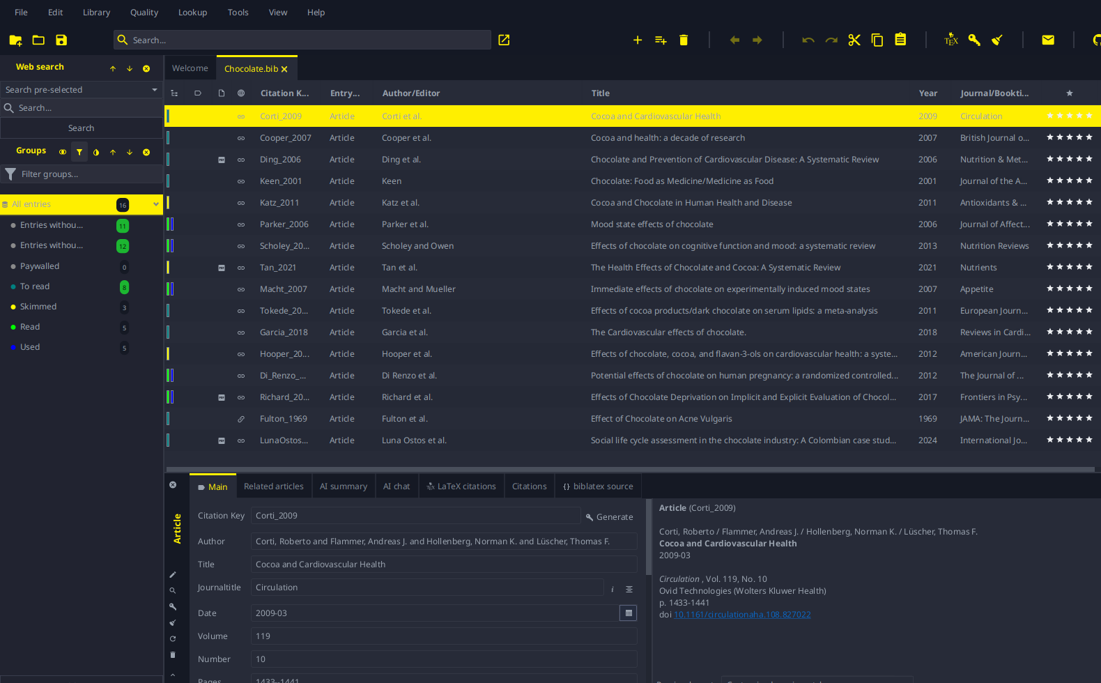 |
| Dracula | 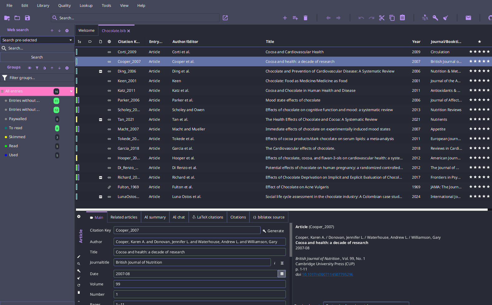 |
| GnomeDarkOrange | 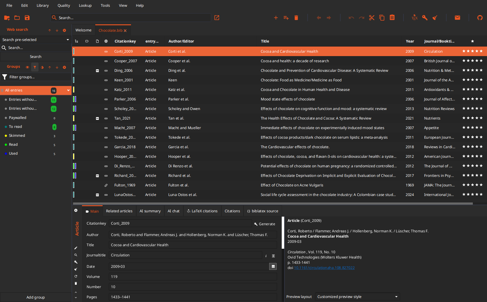 |
| JabRef-black | 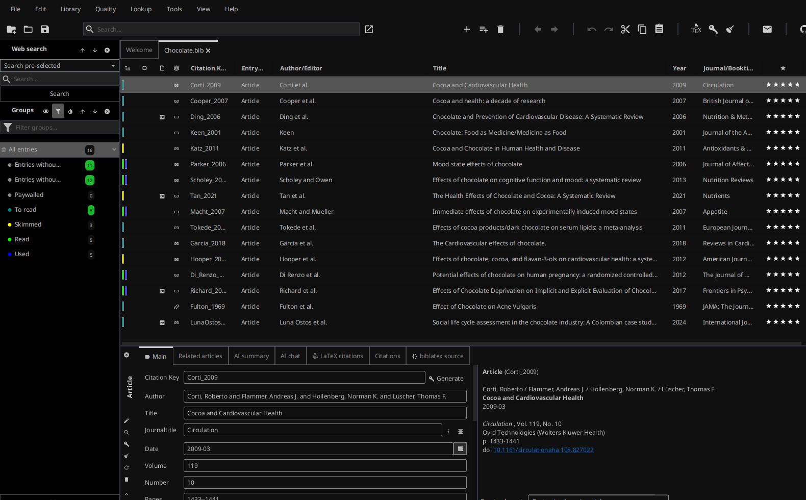 |
Light themes
| Theme | Preview |
|---|---|
| Interoctiv | 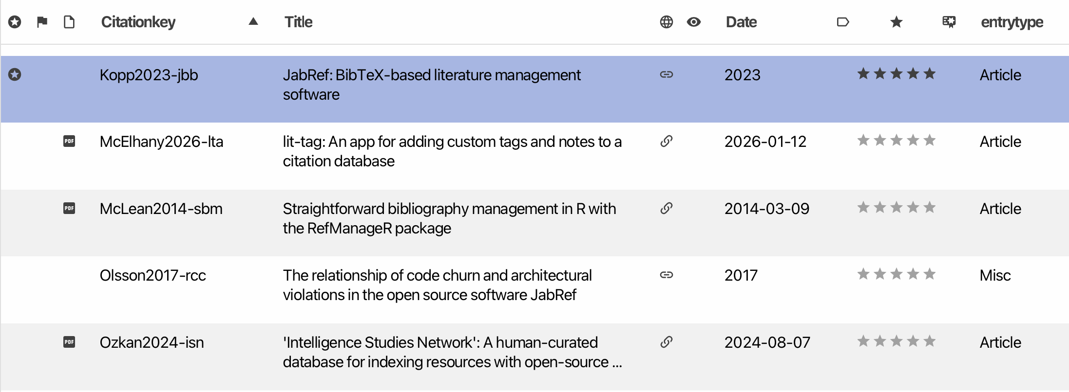 |
Use a custom theme
- Open
File > Preferences > General. - In the Appearance section, choose a Theme and a Color scheme (Follow system, Light, or Dark).
- Tick Custom theme and select your CSS file.
The custom CSS is applied on top of the selected theme and color scheme. Changes to the file are picked up while JabRef is running, so you can edit it and watch the result.
Creating a new theme
All colors of a theme are -color-* variables, for example -color-accent, -color-bg-primary, -color-fg-default, or -color-selection. The complete list, with a comment on what each one is used for, is in jabref-theme.css (and primer.css for the second theme). The rest of JabRef’s styling only uses these variables, so overriding them is all that is needed to re-color the whole UI.
Override a variable for both color schemes:
.root {
    -color-accent: #8F0D11;
}
Override it for one color scheme only. The media query follows the color scheme selected in JabRef (or the operating system, with Follow system):
@media (prefers-color-scheme: dark) {
    .root {
        -color-accent: #ff79c6;
    }
}
Anything else (fonts, sizes, individual controls) can be styled with regular JavaFX CSS; jabref-base.css shows the style classes JabRef uses.
Migrating a theme from JabRef 5.x
The old -jr-* variables no longer exist and are silently ignored. Every variable the previous themes set maps as follows:
| JabRef 5.x | JabRef 6 |
|---|---|
-jr-theme |
-color-accent, -color-link |
-jr-accent |
-color-accent-subtle, -color-selection |
-jr-hover |
-color-overlay-hover, -color-button-hover |
-jr-base, -jr-menu-background, -jr-toolbar |
-color-bg-tertiary |
-jr-background-alt |
-color-bg-primary |
-jr-row-odd-background / -jr-row-even-background |
-color-bg-secondary / -color-bg-alt |
-jr-search-background |
-color-bg-search |
-jr-sidepane-background |
-color-bg-sidepane |
-jr-separator |
-color-border-muted |
-fx-light-text-color / -fx-dark-text-color / -fx-mid-text-color |
-color-fg-emphasis / -color-fg-default / -color-fg-muted |
-fx-control-inner-background / -fx-control-inner-background-alt |
-color-bg-secondary / -color-bg-alt |
-fx-outer-border |
-color-border-light |
-fx-focused-text-base-color |
-color-fg-emphasis |
-jr-green / -jr-light-green |
-color-success / -color-success-emphasis |
-jr-orange |
-color-warning |
-jr-light-red / -jr-red |
-color-danger / -color-danger-emphasis |
-jr-scrollbar-thumb / -jr-scrollbar-track |
-color-scrollbar-thumb / -color-scrollbar-track |
-jr-tooltip-bg / -jr-tooltip-fg |
-color-tooltip-bg / -color-fg-default |
-jr-drag-target / -jr-drag-target-hover |
-color-drag-target / -color-drag-target-hover |
-jr-group-hits-bg / -jr-group-hits-fg |
-color-badge-bg / -color-fg-emphasis |
-jr-selected |
-color-selection |
-jr-accent-alt / -jr-transparent-accent |
-color-accent-subtle / -color-selection-inactive |
-jr-checked |
-color-accent |
-jr-text-area-background |
-color-bg-search |
-jr-sidepane-header-background |
-color-bg-sidepane |
-jr-icon / -jr-icon-active |
-color-fg-default / -color-accent |
-jr-icon-background |
-color-button |
-jr-icon-background-active, -jr-menu-background-active |
-color-overlay-hover |
-jr-icon-background-armed |
-color-overlay-armed |
-jr-warn / -jr-error / -jr-info |
-color-warning / -color-danger / -color-info |
In a dark theme the readable body color is the old -fx-light-text-color, so give -color-fg-default that value as well.
Three groups do not fit a cell:
-jr-theme-text,-jr-search-text,-jr-head-fg,-jr-sidepane-header-color,-jr-menu-foreground,-jr-menu-item-foregroundand-jr-menu-forground-activeall become-color-fg-default, or-color-fg-emphasiswhere the text sits on an accent-colored surface.-jr-white,-jr-black,-jr-blue,-jr-light-blue,-jr-purple,-jr-light-purple,-jr-yellow,-jr-gray-0to-jr-gray-3and-jr-blue-gray-1to-jr-blue-gray-4are raw palette entries with no successor. Set the token of the element you colored with them.-jr-header-heightis not a color. Style the element directly, for example with-fx-pref-height.
Old themes were complete copies of JabRef’s stylesheet. That is no longer needed: keep only the variables you change.
Selection of Useful CSS selectors
| UI element | CSS selector |
|---|---|
| preview box | #previewBody |
{} biblatex source tab |
.code-area |
text in {} biblatex source tab |
.code-area .text |